SERVICIO DE NOTICIAS en favor de la democracia participativa, el desarrollo humano, la paz, el medio ambiente y la cultura.- Santo Domingo, República Dominicana / Luis ORLANDO DIAZ Vólquez - OPINIÓN, NOTICIAS Y COMENTARIOS. Haciendo de la lucha contra la pobreza un apostolado templario./ email: guasabara.editor@gmail.com - http://www.facebook.com/GuasabaraLUISorlandoDIAZ - @GUASABARAeditor
Compañías y países productores están preocupados por la caída de precios del petróleo. Pero no todos pierden. ¿Pueden contribuir los precios bajos del crudo a la recuperación económica global? BBC Mundo te explica cómo.
Siete de sus familiares han sido acusados de abusar de su estatus real para amasar grandes riquezas y llevar a cabo numerosos abusos. De estar muy cerca de convertirse en reina, pasó a perderlo todo.
Elizabeth Lauten, directora de comunicación del congresista republicano Stephen Fincher, renunció este lunes a su cargo, días después de que dijera que las hijas del presidente eran "irrespetuosas" y "no tenían clase".
El ciberataque a Sony, seguido de la filtración de cinco nuevas películas, ha levantado sospechas sobre si Corea del Norte podría estar detrás del hackeo. Pyongyang no lo desmienten y Sony no lo confirma. ¿Qué pasó?
La infección del virus de inmunodeficiencia humana está tardando más en causar sida y los cambios en el virus pueden ayudar a los esfuerzos para contener la pandemia, según investigadores de la Universidad de Oxford.
Se creía que los humanos comenzaron a ingerir bebidas alcohólicas hace 9.000 años, con la aparición de la agricultura. Pero un estudio revela que nuestros ancestros desarrollaron la capacidad de tolerar el etanol mucho antes.
El delantero italiano del Liverpool, Mario Balotelli, se disculpó por colgar una imagen en la red social con referencias que algunos consideraron antisemitas y racistas.
Los dueños de más de 100 castillos en Transilvania luchan por recuperarlos y hacerlos rentables como hoteles. Pero no todos han podido igualar el éxito del Castillo Bran, famoso por su conexión con Drácula.
La irlandesa Stephanie Roche se convirtió en la primera mujer finalista del premio Puskas que la Fifa entrega en honor al legendario artillero húngaro al mejor gol de la temporada.
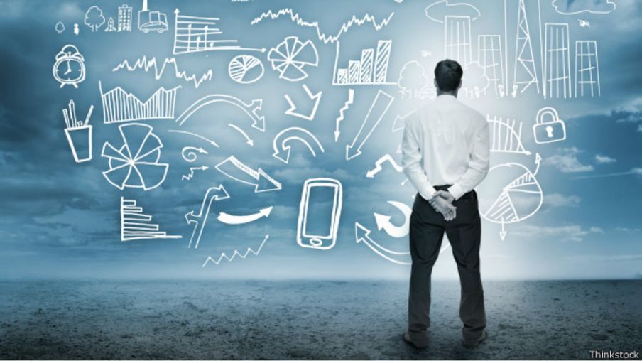
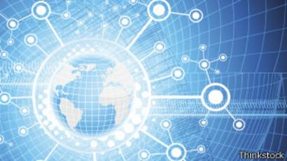
BBC Mundo Tecnología 1 diciembre 2014 Ilustración de conexión a internet Para 2020 habrá una enorme demanda de conexión por el boom de objetos inanimados conectados a internet o el internet de las cosas. ¿Cómo cambiará al mundo la conexión 5G?
Para cuando usemos ropa que se conecta a internet, compremos carros sin conductor que hablan entre sí para evitar accidentes y utilicemos cubos de basura inteligentes que nos avisan cuando están llenos, vamos a necesitar una conexión a internet mucho mejor.
Por eso la carrera mundial para desarrollar 5G, la quinta generación de conexión móvil, ya está en marcha, y los científicos que la dirigen están muy entusiamados porque esta vez lo va a hacer todo diferente.
La conexión 5G permitirá un mundo de ciudades inteligentes e interconectadas, cirugías con robots a distancia y la inmersión en el internet de las cosas (IoT, por su siglas en inglés), es decir, la interconexión digital de todos nuestros objetos cotidianos.
Este escenario será común en apenas seis años: científicos, gobiernos y empresas de comunicaciones investigan y hacen planes para empezar a usar 5G a partir de 2020.
Para entonces los expertos estiman que el número de conexiones que tenemos hoy en día se habrá multiplicado por 10.
"Antes se decía que en 2020 habría 50.000 millones de dispositivos conectados a internet, ahora se cree que esa cifra es cautelosa", le dijo a la BBC Sara Mazur, directora de Investigación de Ericsson, una de las compañías de comunicaciones que está liderando el desarrollo de 5G.
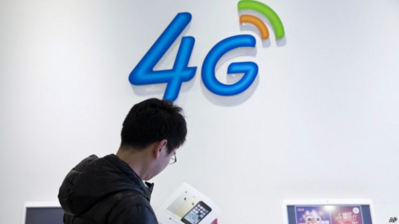
Según Mazur, la conexión 4G no puede soportar esa demanda de conectividad porque no fue diseñada para hacerlo.
Mayor rapidez y mayor capacidad
Una velocidad de 800 Gbps equivaldría a bajarse 800 películas en HD en un sólo segundo.
Cuando Samsung anunció en 2013 que estaba experimentando con 5G a 1 gigabite por segundo (Gbps), los medios informaron emocionados que los usuarios podrían bajarse una película en HD en sólo un segundo.
Ahora, el profesor Rahim Tafazolli, que lidera el Centro de Innovación de 5G de la Universidad de Surrey, Inglaterra, cree que en el futuro será posible tener una conexión de datos inalámbrica a 800 gigas por segundo, es decir, una conexión 100 veces más rápida que las conexiones en 5G que se están probando en la actualidad.
Una velocidad de 800 Gbps equivaldría a bajarse 800 películas en HD en un sólo segundo.
Pero además de rápida, nuestra futura conexión en 5G deberá tener una mayor capacidad.
Aumentar la capacidad de una red es el equivalente de agrandar una carretera por túnel.
Si añades carriles pueden pasar más vehículos.
También es importante poner cierto orden en la carretera: por ejemplo, designar ciertos carriles para el transporte de larga distancia y dejar otros para el tráfico local.
Por eso, con la conexión 5G se establecerán distintas bandas de frecuencia para sobrellevar la demanda.
Ese gigantesco aumento de la demanda será resultado del boom de objetos inanimados conectados a internet, o el internet de las cosas.
Además, "irrompible"
La conexión 4G no podrá satisfacer la demanda para 2020.
Otra característica crucial del 5G deberá ser que no pueda fallar.
"Tendrá la fiabilidad que actualmente tenemos con las conexiones de fibra óptica", dice Sara Mazur.
Los avances en la tecnología de antenas auguran el fin de los cortes repentinos de conexión.
Esa característica será esencial para la seguridad.
Compañías como Huawei, de China, ya están hablando de utilizar 5G para permimitir la comunicación entre carros sin conductor y entre éstos y la infraestructura que los rodea.
Además, servicios como el transporte inteligente o las cirugías a distancia, en las que un ser humano utiliza remotamente un robot para realizar complicadas operaciones, dependerán de la reducción de los períodos de latencia, es decir, los tiempos de demora entre la acción y la respuesta.
Ericsson predice que el período de latencia del 5G girará en torno al milisegundo, es decir, será imperceptible al ser humano y será 50 veces menor que el de 4G.
Una pequeña lección de escuela...
Ericsson predice que el período de latencia del 5G girará en torno al milisegundo, es decir, será imperceptible al ser humano y será 50 veces menor que el de 4G.
Para entender cómo funciona la conexión 5G es clave entender el concepto de la "harmonización de las bandas de frecuencia".
Los datos se transmiten por radiofrecuencias, que están divididas en distintas bandas.
Las bandas de frecuencia son intervalos de frecuencias del espectro electromagnético asignados a diferentes usos dentro de las radio comunicaciones.
Por ejemplo, algunas bandas son para el envío de señales aeronáuticas y de navegación marítima, otras para transmisiones de televisión, otras para datos.
El uso de estas bandas puede cambiar de un lugar a otro y está regulado por la Unión Internacional de Telecomunicaciones (ITU por sus siglas en inglés) y puede variar según el lugar.
Según Ed Ram, periodista de tecnología de la BBC, actualmente el espectro de bandas de frecuencia "es un lío" y esto "ha causado problemas con la rapidez de conexión y la confiabilidad".
Así que para allanar el camino hacia la 5G la ITU está restructurando en profundidad las partes de las radiofrecuencias utilizadas para la transmisión de datos, a la vez que permite el uso continuado de las comunicaciones ya existentes en 3G y 4G.
¿A qué precio?
Para allanar el camino hacia la 5G se están restructurando las radiofrecuencias utilizadas para la transmisión de datos.
Ericsson y Huwaei dicen que por ahora no se sabe cuánto costará la conexión 5G.
No se puede calcular hasta que empiece la fase de desarrollo de producto.
Aún así, ya hay iniciativas para llevar los resultados de las investigaciones al mercado.
En Corea del Sur, que ya fue pionera en el desarrollo de 4G, Samsung espera poder lanzar una red temporal de prueba en 5G a tiempo para los Juegos Olímpicos de Invierno de 2018.
Y Huawei compite para poner en práctica su propia versión de conexión 5G en Msocú durante la Copa del Mundo de fútbol, también en 2018.
La buena noticia es que, a pesar de la rivalidad y de las gigantescas sumas de dinero que estas compañías está invirtiendo en investigación y desarrollo, en términos generales están colaborando para poder ofrecer una conexión en 5G.
Y eso abre la puerta para un desarrollo sin paralelo de nuevas tecnologías.
"Eso, hasta que llegue la conexión 6G, allá por 2040", puntualizó Tafazolli.
Sigue la sección de tecnología de BBC Mundo a través de@un_mundo_feliz
PorServicios de Acento.com.do.1 de diciembre de 2014 - 5:00 pm - http://acento.com.do/2014/actualidad/8200496-conavihsida-pide-sector-privado-disponer-recursos-para-programas-vih/
Su director Víctor Terrero, hizo el llamado al conmemorar este 1 de diciembre el Día Mundial del Sida junto a funcionarios, agencias de cooperación y organizaciones de la sociedad civil.
SANTO DOMINGO, República Dominicana.-El director ejecutivo del Consejo Nacional para el VIH y el Sida (CONAVIHSIDA), Víctor Terrero, pidió al sector privado que destine recursos para los programas de VIH y así poder hacerlos más sostenibles.
Terrero hizo el llamado al conmemorar este 1 de diciembre el Día Mundial del Sida junto a funcionarios, agencias de cooperación y organizaciones de la sociedad civil.
“Hacemos en este día un llamado al sector privado para que, en el marco de su responsabilidad social, destine recursos para financiar programas de VIH”, puntualizó.
Aseguró que para hacer sostenible la respuesta del país a esa epidemia hace falta la participación de todos los sectores.
El funcionario expresó que la sostenibilidad financiera es uno de los retos que debe afrontar el país para mantener el desempeño del programa.
“El reto ante la nueva situación de la epidemia país es la sostenibilidad de la respuesta nacional a las ITS y al VIH y Sida, y el suministro de información confiable para la toma de decisiones, mediante el incremento de la inversión, la mejora de los sistemas de información, el fortalecimiento de la coordinación y la capacidad de respuesta de los distintos actores”, añadió.
Terrero reiteró que la prevalencia del VIH en la población general se mantiene en 0.8, con una tendencia a la baja, lo cual atribuyó al impacto de los programas en curso.
“La epidemia del VIH muestra una tendencia a la estabilidad, con un 0.8 por ciento de prevalencia y una reducción mayor al 35 por ciento de los nuevos casos de infectados por VIH, desde el 2003; mientras que el número de defunciones estimadas, relacionadas al SIDA, habría disminuido en el periodo 2007-2014, de 2,690 a 1,799”, informó el galeno.
Víctor Terrero citó entre los retos del país frente a la epidemia fortalecer las intervenciones directas en las poblaciones clave, donde se reporta el incremento de la prevalencia, el fortalecimiento de la atención a las personas con VIH y la eliminación de la transmisión materno infantil.
“Para lograr la eficiencia en esas acciones se precisa la reorganización de la atención del VIH desde la atención primaria, desarrollar sistemas de información para medir cobertura por tipo de población abordada y ampliar la población objeto de atención”, afirmo Terrero.
También la ampliación de la red de laboratorios para pruebas de tamizaje, la capacitación del personal de esos y garantizar los insumos que intervienen en el proceso.
Un mapa interactivo elaborado por 'The Economist' muestra cómo aumenta el endeudamiento en todo el mundo. El instrumento permite identificar cuáles son los países con mayor deuda pública en función de su producto interior bruto (PIB).
De acuerdo con el mapa interactivo elaborado por 'The Economist', Japón se ubica primero en la lista dado que su endeudamiento público representa el 247% de su PIB. En segundo lugar figura Zimbawe, con una deuda pública del 202%; y en el tercero Grecia, con el 151%.
La deuda pública de Estados Unidos, que ocupa el lugar 36 de la clasificación, alcanza el 108% del valor de su PIB. Puerto Rico se ubica en el primer lugar en la lista de regiones latinoamericanos, con un 96,5% de deuda respecto al PIB. Lo siguen Brasil (54%), Costa Rica (54%), Argentina (38%) y Uruguay (35%).
Dado que el PIB se refiere al valor monetario de la producción de bienes y servicios de demanda final de un país durante un año, una manera de contener el avance de la deuda es con incrementos en la producción. Si la producción es mayor a los costos de la deuda, queda un saldo positivo que permite disminuir la deuda.
El 'reloj' de la deuda pública mundial llega a una cifra superior a 54 billones de dólares, lo que representa 7.700 dólares por cada habitante del planeta, algo dramático si consideramos que el 40% de la población mundial vive con menos de 2 dólares diarios.
Our interactive overview of government debt across the planet
The clock is ticking. Every second, it seems, someone in the world takes on more debt. The idea of a debt clock for an individual nation is familiar to anyone who has been to Times Square in New York, where the American public shortfall is revealed. Our clock (updated September 2012) shows the global figure for almost all government debts in dollar terms.
Does it matter? After all, world governments owe the money to their own citizens, not to the Martians. But the rising total is important for two reasons. First, when debt rises faster than economic output (as it has been doing in recent years), higher government debt implies more state interference in the economy and higher taxes in the future. Second, debt must be rolled over at regular intervals. This creates a recurring popularity test for individual governments, rather as reality TV show contestants face a public phone vote every week. Fail that vote, as various euro-zone governments have done, and the country (and its neighbours) can be plunged into crisis.
Notes:
This interactive graphic displays gross government debt for the globe. The clock covers 99% of the world based upon GDP. It uses latest available data and assumes that the fiscal year ends in December.
Debt figures are derived from national definitions and therefore may vary from country to country.
The clock shows the estimated debt at the point corresponding to the current date and time in whatever year you are viewing; this is why it increases even when you view past or future years.
All data is mapped on modern borders (Montenegro split from Serbia in 2006, Kosovo in 2008. South Sudan split from Sudan in 2011. Data for these countries are included in their parent nations' prior to these dates).